Implementing a New Design System Across Multiple Platforms
2023
The Mom Project
Visual Design/UI, Prototyping, User Experience, Design Systems, Design Strategy, Cross-Functional Leadership


Impact
Over two quarters, the team shipped 40+ reusable components, the majority adopted across 2 products, speeding up delivery for both design and engineering.
Background
Our Product Design leader established OKRs for the team, and to meet those goals, the design system initiative was born. Our aim was to create a consistently high quality bar across the user experience as a team. This included establishing a UX Pattern Library and supporting the company's rebranding.
Our product had out of date code, no central design system, and old branding. As a result, we were designing and building inefficiently, and our user experience was suffering.
My role
I was Senior Product Designer on this project, and was later promoted to Lead Product Designer in recognition of this work.
Thought leader and strategic partner to the design director and engineering manager
Collaboration on framework research, project governance, prioritization, and project management
Created, established, and maintained components in the Figma library
Collaborated with engineers to implement components
Contributed to stakeholder presentations, team communication, and design system education
Constraints
There was no existing pattern to build from, we were introducing a shared design language while both design and engineering kept shipping feature work in parallel. Adopting MUI as a framework meant reconciling it with an existing, inconsistent codebase, and moving fast meant giving up centralized control: components were owned jointly by a designer and an engineer pair rather than a single design system team, which kept us unblocked but required real trust and clear standards to stay consistent.
The Design Process
Setting governance
We started by defining project governance and selecting MUI as our design system framework.
Meeting and reviewing processes
Designers brought components to a weekly review with engineering for early feedback. Engineers brought in-progress work and QA back to designers in turn.
Design and documentation standards
Any new component followed relationship standards and rules around constraints and auto-layout, and had to include all states. Before engineering could add it to the system, it needed full documentation, including spacing and variants.
Establishing federated ownership
We wanted to move quickly without bottlenecks, so we chose shared ownership: each component had a designer paired with a dedicated engineer, with a peer review step built in

Project planning and documentation for team communications.
Building the foundation
We built the foundations for the product brand as an extension of the new marketing brand, including typography, color, iconography, spacing, and a grid system.
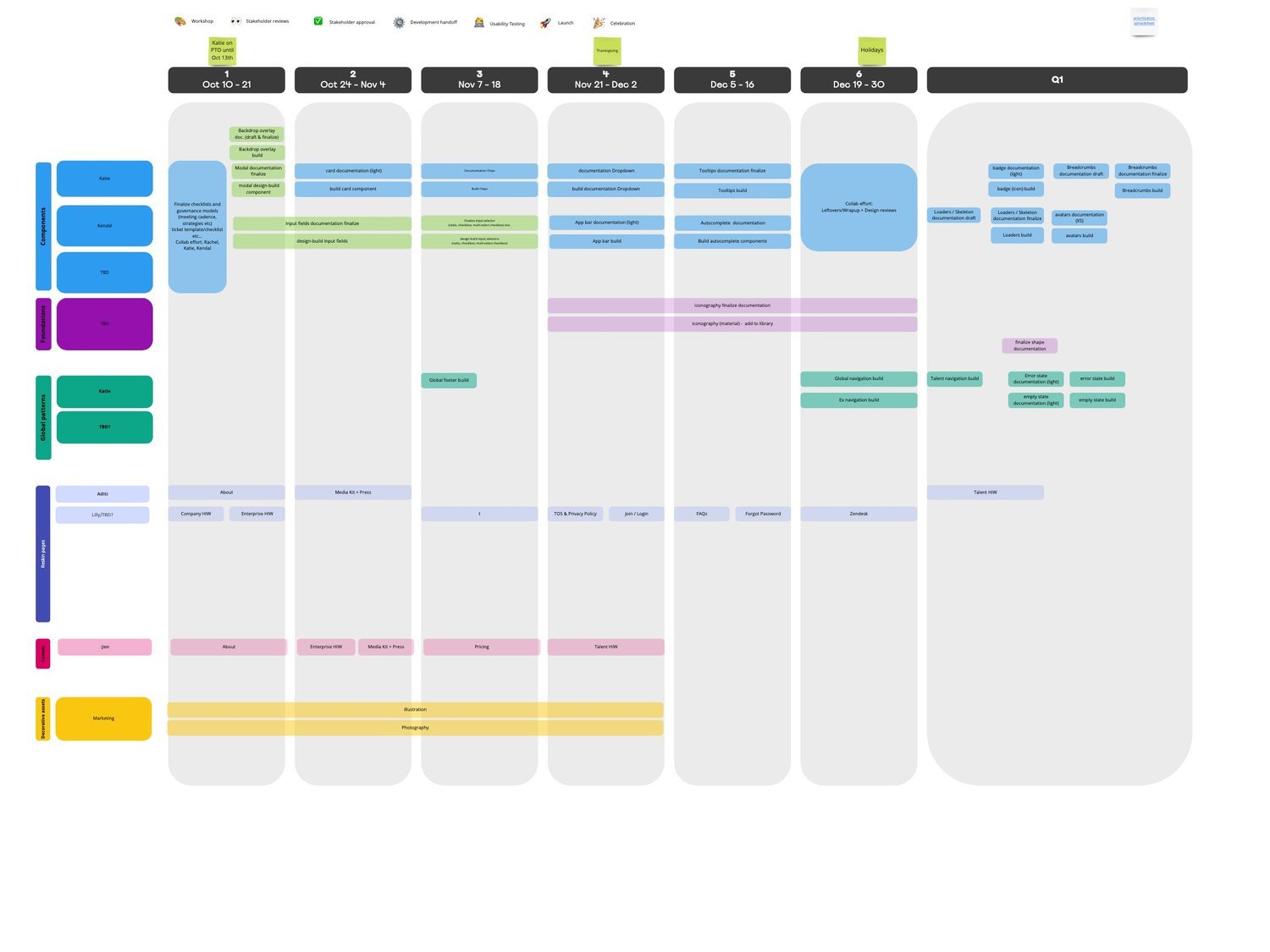
Roadmap-aligned component planning, tracked first in Miro, then in Excel as scope solidified.

Documentation example, foundations: color.

Documentation example, foundations color usage.

Documentation example, foundations typography.
Documenting components
More complex components were documented before handoff. Once complete, each was usable by our design standards in the Figma library, with documentation covering usage, interaction states, and variants.

Documentation example, button states and variants.
Demo to share how design is utilizing the design system to create quick UI.

Documentation example, covering button usage standards, states, and variants, prepared for engineering handoff.

Documentation example, covering chip usage standards, states, and variants, prepared for engineering handoff.

Documentation example, covering chip usage standards, states, and variants, prepared for engineering handoff.

Documentation example, new product screens migrated to the new codebase and design system.

Documentation example, new product screens migrated to the new codebase and design system.
Outcome
Over two quarters, the team shipped 40+ reusable components, the majority adopted across 2 products. Creating the design system let the design team move faster on new work and gave engineering a consistent foundation to build from.
Reflection
This project reinforced two things: Figma's auto layout, variants, and booleans can meaningfully speed up a design team's output, and a shared language between designers and engineers is what actually makes that speed possible, not just the tooling itself.